What is a Histogram
A histogram is a graphical display of data using bars of different heights. Histogram allows a visual interpretation of numerical data by indicating the number of data points that lie within a range of values, called a class or a bin.
It is similar to the look of a bar graph, but a histogram group’s numbers into range.
Illustrated below is a sample of a histogram.
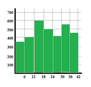
The above histogram shows the number of customers of different ages visiting a mall. On the horizontal line is the age, while on the vertical line is the number of customers of a certain age.
If observed the ages are divisible by 6, this range is what we called the BIN. There are few steps on how to make a histogram, and these are the following
To construct a HISTOGRAM, first and foremost bin the range of values. That is done by dividing the entire range of values into a series of intervals, and then count how many values fall into each other interval.
As illustrated above. A range 0 to 42 is to be divided in 7 equal intervals.
So the bins are 0 -6, 7 – 12, 13 – 18, 19 – 24, 25 – 30, 31 – 36, 37 – 42.
- Determine the count of each bin, and create a rectangle to interpret each intervals count. For example, range 0 – 6 has a value of 350. So a rectangle was drawn from point 0 up to the middle of 300 to 400.
Let us try one example for you to understand more.
Shown below is the bin/ interval and its count. Draw the histogram to interpret the given data
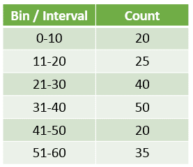
Using the above data, let’s make the histogram.
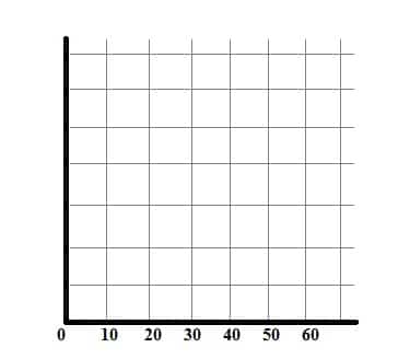
First draw a graph, and write the intervals in the x – axis.
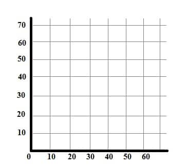
Second, write the count in the y – axis/ vertical line.
To make it easier use 10 – 50 for the count.
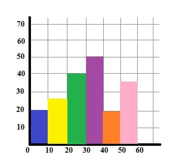
Then plot the points in the bar histogram. So if asked how many counts were in the 38 to 40 range, the answer in 20.
If asked how many counts or frequency is from range 51 – 55, the answer is 35.
Unlike a Bar Graph a Histogram is grouped of intervals on the x axis while a bar graph only considers one value
We will now cover different Types of Histograms
- Uniform
- Bimodal
- Symmetric
- Random
- Bell Shaped
The first one is the
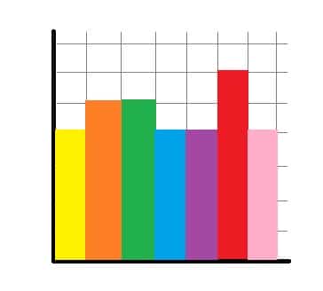
UNIFORM HISTOGRAM
This histogram gives a very little information for a data set.
Almost all the patterns are of same height or frequency.
Just like the illustration shown, even some intervals have the same height or frequency.
The second type is the
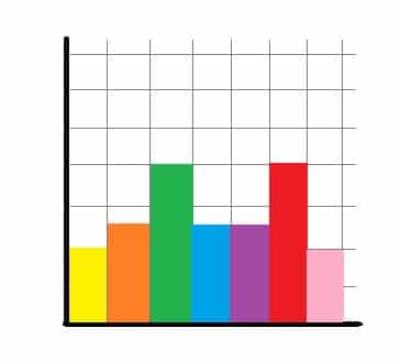
BIMODAL HISTOGRAM
This histogram will have two peaks, which gives us the insight that the data comes from two different sources.
As seen in the illustration green and red rectangles are the two peaks of the graph
The third type is the
SYMMETRIC HISTOGRAM
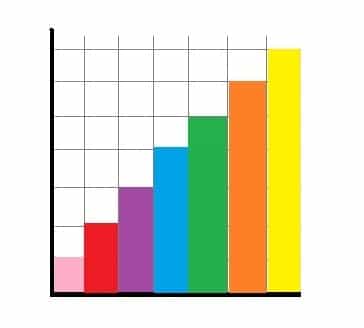
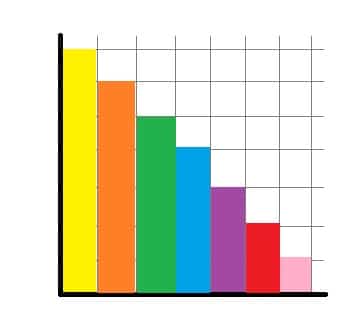
It is symmetric if is its right half is exactly similar to its left half.
The two images below are the two classifications of symmetric histogram.
The 1st one is skewed to the right, while the second one is skewed to the left
RANDOM HISTOGRAM
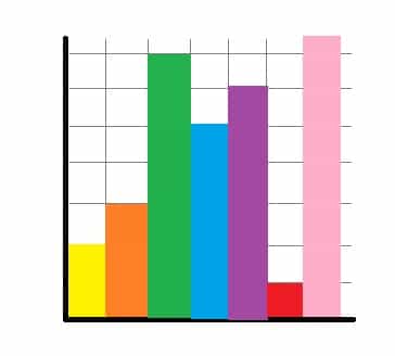
It does follow a pattern for the data set. And it has several peaks, which data can be analyzed separately
And last but not the least is the
BELL SHAPED HISTOGRAM
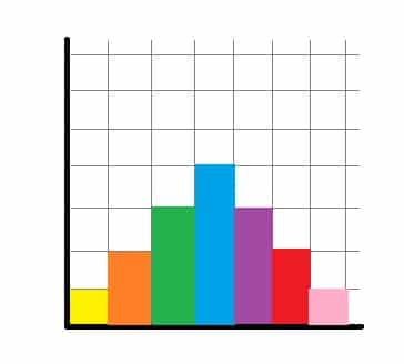
Its frequency and intervals looks like a normal distribution.
It follows the pattern of ascending graphs, then reach a peak before it descends again
Test your knowledge on Histograms
Let us evaluate your learning by identifying and analyzing the histograms.
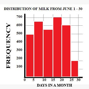
Use the below image for all the questions
Are your ready to practice more, why not register and take the test on graphs
